CSS Flex


Flexbox is a one-dimensional layout method for arranging items in rows or columns. Items flex (expand) to fill additional space or shrink to fit into smaller spaces. This article explains all the fundamentals. It is used to set the length of flexible items. The flex property is much responsive and mobile-friendly. It is easy to position child elements and the main container. The margin doesn’t collapse with the content margins. The order of any element can be easily changed without editing the HTML section.
Syntax:
flex: flex-grow flex-shrink flex-basis |auto |initial |inherit;
flex-grow Property: A number that specifies, how much items will grow relative to the rest of the flexible items.
flex-shrink Property: A number that specifies, how much items will shrink relative to the rest of the flexible items.
flex-basis Property: It sets the length of items. Legal values of flex-basis are: auto, inherit, or a number followed by %, em, px, or any other length unit.
flex-wrap Property: The CSS flex-wrap property is used to specify whether flex items are forced into a single line or wrapped onto multiple lines.
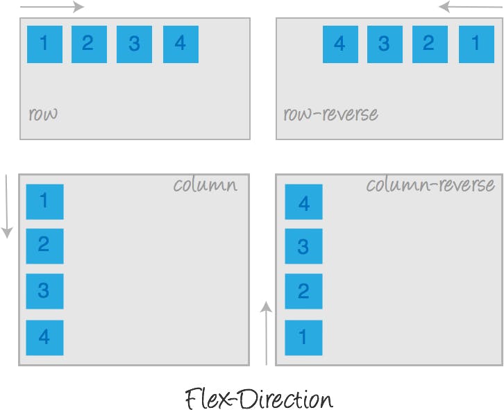
flex-direction Property
The flex-direction property is sub-property of flexible box layout module. It established the main axis of the flexible item. the main axis of the flex item is the primary axis. It’s not necessarily horizontal all the time it basically depends on the flex-direction property.
Syntax:
flex-direction: row| row-reverse| column| column-reverse;
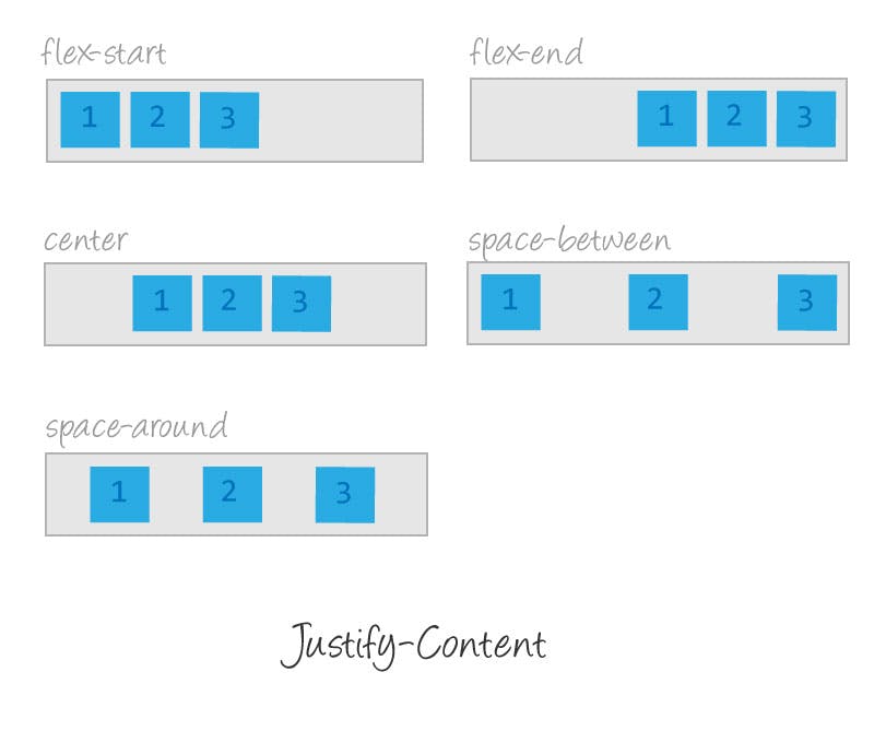
Justify Content
The justify-content property is used to align the flex items in the direction of the flex container.
For example, if the flex container direction is a row, setting the value of the justify-content property affects the positions of all the elements on the row, as shown in the following image.
Syntax
justify-content: flex-start | flex-end | center | space-between | space-around
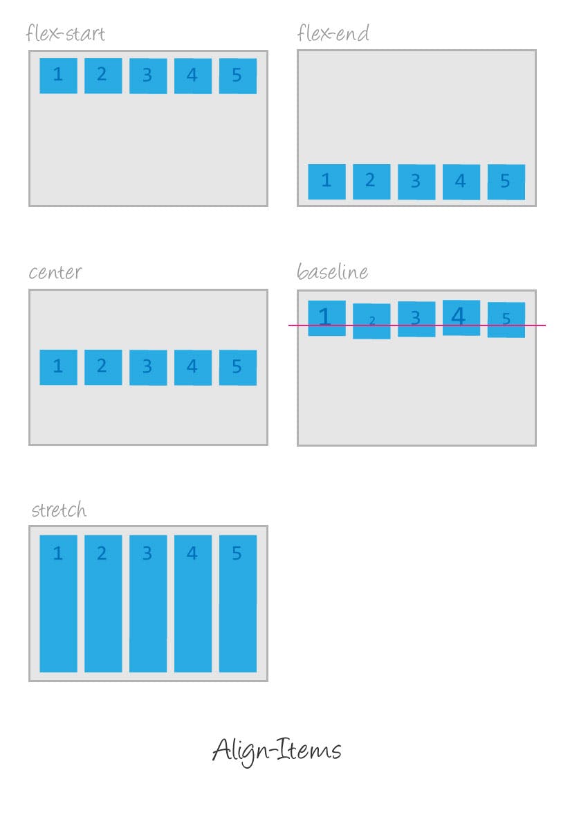
Align Items
The align-items property is used to align the flex items in the opposite axis (also called the cross axis) of the container. For example, if the flex container direction is a row, setting the value of the align-items property affects how the elements are positioned vertically inside the flex layout, as shown in the following image.
Syntax
align-items: flex-start | flex-end | center | baseline | stretch
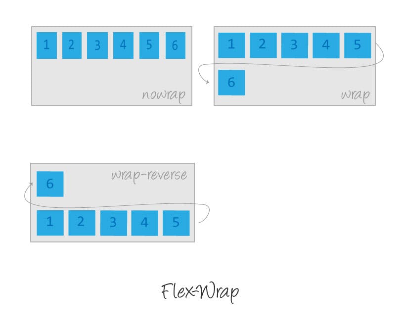
flex Wrap
The flex-wrap property controls whether the flex container is single-line or multi-line, and the direction of the cross-axis, which determines the direction new lines are stacked in.
Syntax
flex-wrap: no wrap | wrap | wrap-reverse
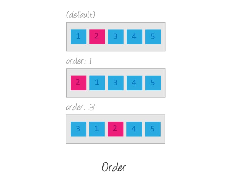
order
Flex items are, by default, displayed and laid out in the same order as they appear in the source document. The order property can be used to change this ordering.
The order property controls the order in which flex items appear within their flex container, by assigning them to ordinal groups. It takes a single value, which specifies which ordinal group the flex item belongs to.
Syntax
order: <integer>