Input Elements of HTML


The HTML element is used to create interactive controls for web-based forms in order to accept data from the user; a wide variety of types of input data and control widgets are available, depending on the device and user agent. The element is one of the most powerful and complex in all of HTML due to the sheer number of combinations of input types and attributes.
The different input types are as follows:
- Button : A push button with no default behavior displaying the value of the value attribute, empty by default.
- Check box: A check box allowing single values to be selected/deselected.
- color : A control for specifying a color; opening a color picker when active in supporting browsers.
- date :A control for entering a date (year, month, and day, with no time). Opens a date picker or numeric wheels for year, month, day when active in supporting browsers.
- datetime-local: A control for entering a date and time, with no time zone. Opens a date picker or numeric wheels for date- and time-components when active in supporting browsers.
- email :A field for editing an email address. Looks like a text input, but has validation parameters and relevant keyboard in supporting browsers and devices with dynamic keyboards.
- file: A control that lets the user select a file. Use the accept attribute to define the types of files that the control can select.
- hidden :A control that is not displayed but whose value is submitted to the server. There is an example in the next column, but it's hidden!
- image :A graphical submit button. Displays an image defined by the src attribute. The alt attribute displays if the image src is missing.
- month: A control for entering a month and year, with no time zone.
- number :A control for entering a number. Displays a spinner and adds default validation. Displays a numeric keypad in some devices with dynamic keypads.
- password :A single-line text field whose value is obscured. Will alert user if site is not secure.
- radio :A radio button, allowing a single value to be selected out of multiple choices with the same name value.
- range :A control for entering a number whose exact value is not important. Displays as a range widget defaulting to the middle value. Used in conjunction min and max to define the range of acceptable values.
- reset :A button that resets the contents of the form to default values. Not recommended.
- search : A single-line text field for entering search strings. Line-breaks are automatically removed from the input value. May include a delete icon in supporting browsers that can be used to clear the field. Displays a search icon instead of enter key on some devices with dynamic keypads.
- submit :A button that submits the form.
- tel :A control for entering a telephone number. Displays a telephone keypad in some devices with dynamic keypads.
- text :The default value. A single-line text field. Line-breaks are automatically removed from the input value.
- time :A control for entering a time value with no time zone.
- url :A field for entering a URL. Looks like a text input, but has validation parameters and relevant keyboard in supporting browsers and devices with dynamic keyboards.
- week :A control for entering a date consisting of a week-year number and a week number with no time zone.
html>
<head>
<meta http-equiv="Content-Type" content="text/html; charset=iso-8859-1">
<title>HTML input tag example - HTML | </title>
</head>
<body>
<form name="example_input" action="html-input-tag-example.html">
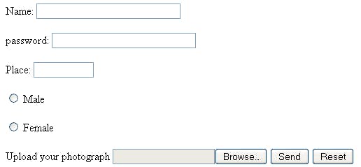
Name: <input type="text" size="30" /><br /><br />
password: <input type="password" size="30" /><br /><br />
Place: <input type="text" size="10" /><br /><br />
<input type="radio" name="sex" value="Male" /> Male<br /><br />
<input type="radio" name="sex" value="Female" /> Female<br /><br />
Upload your photograph <INPUT type="file" name="photo">
<input type="submit" value="Send" /> <input type="reset" />
</form>
</body>
</html>
Output: